
Course Resources
Resources for teaching our High School Statistics curriculum.
- Lesson Flow - timing and flow of class, using our lesson materials
- Pacing Guide - pacing our units, with daily or block schedules
- Alignment Guide - aligning our lessons to national and state standards for high school statistics
- Classroom Routines - a guidebook of classroom routines embedded within our lessons
Teaching Resources
Resources for teaching with Skew The Script.
- Discussion Norms - our model discussion norms for the classroom
- Letter to Parents - letter to share with parents about our nonpartisan approach
- Teaching Math on Civic Topics - tips for teaching math lessons that cover civic topics
Lesson Notes
Lesson-specific insights from the creators of this lesson.

In this lesson, students learn the right questions to ask when determining how much money they’ll really get paid by future employers. In doing so, they walk away with a deeper understanding of measures of center, boxplots, and resistance to outliers – along with how easy it can be to mislead with data.
- Calculate and interpret the five-number summary
- Determine if a data set contains outliers and determine the effect of outliers on summary statistics
- Graph and interpret boxplots
With the foundational statistics now in their ‘toolbox,’ in this lesson students are ready to develop five-number summaries and to use them to create / interpret boxplots. Students also build on their understanding of extreme variability from lesson 1.3 by defining and discussing outliers. Two different ways to determine outliers are included: the “eyeball it” method and the Interquartile Range (IQR) method. As the final piece, students consider the effect of outliers on measures of center and spread. With this rather comprehensive look at the statistics of a quantitative variable, they are prepared to compare different distributions – a task they tackle in the next lesson.
Before proceeding: Familiarize yourself with the lesson materials linked above (e.g. handout, handout key, slides, video). Then, for additional background and teaching tips from the lesson creators, check out the sections below.
- When arriving at the Key Question (How much money will you really make?), take a moment to surface students’ initial thoughts. In particular, prompt them to think about what questions they’d ask the employer about the statement: “The typical salary at our company is more than $65,000 per year.” In brainstorming questions, students will start to develop some intuition for how this figure could be misleading.
- The Star Builders salary data set has one outlier, and it’s a high outlier. The lesson explores the effect of this high outlier on different summary statistics. For robustness, it’s also helpful to show them the effect that a low outlier would have on the different summary statistics (e.g. how a low outlier test score would lower the average test score).
- Two approaches to determining outliers are included in this lesson. The ‘eyeball it’ approach may appeal to intuitive thinkers. For those who appreciate algorithms, the IQR method is included, but its use is optional. A variety of other methods exist in the statistical world, one of which (the 2 standard deviations method) is included in AP Statistics and can be found in Lesson 1.A.5 for that course. Regardless of the method used, the key learning here is to recognize outliers as unusually high or low data values that may impact some statistical measures.
First, download this lesson's slide deck and handout key to see the prompt and sample responses for the Lesson Starter. Then, check out the additional background notes below.
Instructional routine: Ten-Minute Talk. The lesson provides space for students to jot down their thoughts on the prompt, before discussing with a partner and engaging in whole group discussion. You can find more background on implementing a Ten-Minute talk here.
Purpose & Background: The goal of this Lesson Starter is to interpret statistical measures in context. In this ten-minute talk, students will apply the statistical measures introduced in the previous lessons to consider the context of registered nurse salaries. Their responses may provide insight into their understanding of these measures and their understanding of the connections between them. In particular, students may draw a connection between the 25th/75th percentiles in nurse salaries and the fact that these figures represent Q1/Q3 in the distribution. Discussing salaries, along with their variation and measures of central tendency, tees up the Key Question for the lesson.
First, download this lesson's handout key and read through its Discussion Question section. Then, check out our model discussion norms and the additional background notes below.
- As suggested in the Discussion Question’s hint, having students manually calculate the different summary statistics before and after the boss’s raise helps them build intuition for why some measures are resistant and other measures aren’t. The key point to emphasize is that the resistant measures (median, IQR) are based on positions in the data set and, therefore, are not as affected by extreme values. The unresistant measures (mean, range, standard deviation) involve the values of the most extreme data points (e.g. the min and max) somewhere in their calculations. Hence, these measures are more sensitive to changes in these extreme values.
- An optional extension to the Discussion Question: What other contexts can you think of that would produce datasets with outliers or extreme skewness? How could different reported summary statistics be misleading in these contexts?
- The 13 company salaries are a simulated data set, created for pedagogical purposes. However, the high outlier and right skew shape are indicative of real income data, which tends to be right skew and contain high outliers. To surface this, ask students: “Do you believe the mean salary would paint a misleading picture at most companies, or just this one? Why?”
- Boxplots are especially useful for larger data sets, in which a dotplot or histogram could be visually overwhelming. Because boxplots directly display certain measures of center (median) and spread (IQR), students should use those measures when describing a boxplot (rather than, for example, trying to visually estimate the mean or standard deviation).
- Although their visual simplicity is useful in many respects, boxplots lack visual information on two important aspects of quantitative distributions: sample size (the number of data values) and peaks (e.g. unimodal, bimodal, uniform). In particular, if peaks or modes are of interest, encourage students to use dotplots or histograms.
- In this course, outliers are visualized in boxplots with dots or asterisks. However, in other contexts, boxplots are graphed such that the whiskers extend all the way to the minimum and maximum – regardless of whether or not those values are outliers. It’s worth mentioning to students that both conventions for graphing boxplots are popular in the broader field.
Student Supports
Lesson-specific resources to support all learners.
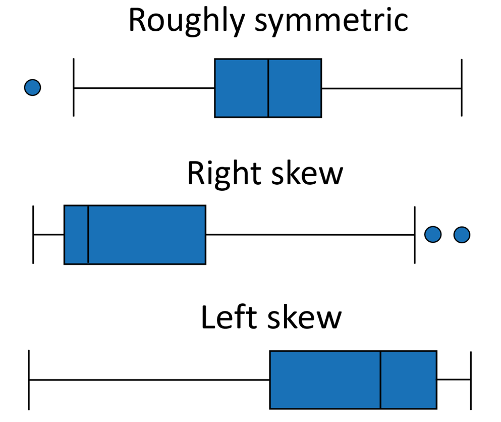
- The following visual can help demonstrate how to interpret the shape of boxplots:
- Vocabulary used in the context of the lesson may include words that are unfamiliar or have several meanings. In particular, the following mathematical terms may need clarification or a definition provided:
- Outlier
- Boxplot
- Summary Statistics
- Resistance
- In addition, the following contextual terms may need clarification or a definition provided:
- Salary
- Drawing connections between mathematical and non-mathematical uses of the term “resistance” can help students internalize its mathematical definition. For example, a teacher (Mr. Median) who does not succumb to their temptation to eat the donuts in the teachers’ lounge is “resistant” to the donuts. Their colleague (Mr. Mean) who eats 12 of them is not resistant.
- Measures of center and spread that are resistant to outliers and skew are also sometimes called “robust” measures.