Lesson 1.1 - Misleading with Data
Key Question: How can we tell if a data visual is misleading?
Content: Observations & Variables | Classifying Variables | Misleading Graphs
Video
Course Resources
Resources for teaching our High School Statistics curriculum.
- Lesson Flow - timing and flow of class, using our lesson materials
- Pacing Guide - pacing our units, with daily or block schedules
- Alignment Guide - aligning our lessons to national and state standards for high school statistics
- Classroom Routines - a guidebook of classroom routines embedded within our lessons
Teaching Resources
Resources for teaching with Skew The Script.
- Discussion Norms - our model discussion norms for the classroom
- Letter to Parents - letter to share with parents about our nonpartisan approach
- Teaching Math on Civic Topics - tips for teaching math lessons that cover civic topics
Lesson Notes
Lesson-specific insights from the creators of this lesson.

This lesson welcomes students to the study of statistics by inviting them to look at data visuals with a more critical eye. They analyze and discuss a variety of graph types, many with misleading or confusing characteristics. Ultimately, students realize that they have to consider all the details, dig a bit deeper, and ask the right questions before buying into what may be a targeted message. It’s their first step on the journey to never look at numbers, data, or the world around them the same way ever again. In the words of the modern philosopher John McClane: “Welcome to the party, pal!”
- Recognize observational units and variables in a data set
- Categorize variables as quantitative or categorical
- Identify misleading features in graphs
Many students enter their first statistics course with the notion that “data” is synonymous with “truth.” This lesson complicates that notion by presenting examples of graphs that tell very different stories – even though the underlying data is exactly the same. For many learners, this can be disorienting. However, it’s the first step in developing a more nuanced understanding of data analysis. In particular, students walk away from this lesson realizing that data isn’t truth. Rather, it’s evidence. And it’s only through careful analysis of that evidence that we can arrive at convincing truths. Ultimately, this lesson sets the stage for a school year of learning how to think more critically and deeply with data – and leaves students excited to learn more. Let’s get started.
Before proceeding: Familiarize yourself with the lesson materials linked above (e.g. handout, handout key, slides, video). Then, for additional background and teaching tips from the lesson creators, check out the sections below.
- As students discuss and identify misleading features in graphs, including distortion of axis scales, use of multidimensional pictographs, and use of convenient domains, there is a key opportunity to highlight how important labels are for visual representations. This will help students find value in making precise labels for their own data visuals, rather than thinking of labeling as a trivial detail.
- For each misleading graph, asking “what would be a better way to represent this data?” provides students with agency and the opportunity for creative thinking to reinforce the key concepts of the lesson.
- Students will manually create a few graphs of their own in this lesson, and it’s good to emphasize that they should be able to do so. However, instructors can foreshadow that students will spend much more time in this course analyzing pre-drawn graphs or creating graphs with technology. Offering students this glimpse into the future may be helpful in creating the vision for the course as focused on analysis and critical thinking, rather than manual procedures. It will remain students’ responsibility, however, to recognize and avoid creating graphs that are misleading.
First, download this lesson's slide deck and handout key to see the prompt and sample responses for the Lesson Starter. Then, check out the additional background notes below.
Instructional routine: Notice & Wonder. The lesson handout provides a Notice & Wonder T-frame for students to capture their notes and ideas. It is important that students recognize the difference between a noticing (observation) and a wondering (question that comes to mind). You can find more background on implementing a Notice & Wonder here.
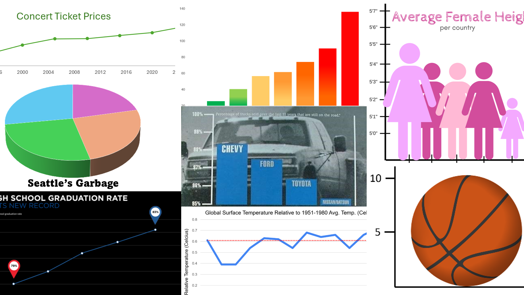
Purpose & Background: The goal of this Lesson Starter is to open the course with questioning sources and images, in an accessible way. The graph that students analyze is one that we return to later in the lesson: a data visualization describing basketball player Kobe Bryant. Specifically, the graph shows the average number of shots that Kobe made per game (9.8) and the average number of assists he had per game (5.0) in the 2009-2010 NBA season. In basketball, an “assist” occurs when a player passes the ball to a teammate, who then scores. However, for the Lesson Starter, none of this background information is given. Students are only given the two basketballs and the axes, with scales and labels. The goal for the Lesson Starter is get students questioning and thinking about this graphic, which will help prime them for the later discussion of this graph in context. As such, none of the context about Kobe Bryant or the exact values for shots/assists should be revealed during the Lesson Starter phase of the lesson.
First, download this lesson's handout key and read through its Discussion Question section. Then, check out our model discussion norms and the additional background notes below.
- It is important to set the stage for discussion beginning on Day 1. Taking the time to develop a conversation and demonstrate appreciation for all inputs will lay the foundation for more complex contexts later in the course.
- Beyond the features mentioned in the lesson handout key, there are additional oddities among the graphs in the Discussion Question. For example, the time intervals on the x-axis aren’t uniform. Neither graph is fully labeled with a title or x-axis label. No information is given as to whether the dollar amounts have been adjusted for inflation (they haven’t). Students may also surface these ideas during class conversation.
- The data for the graphs was compiled by CouponBirds, based on publicly available ticket price information for major U.S. tours and from Pollstar (a data aggregator for the global concert industry). Dollar amounts are not adjusted for inflation. To see inflation-adjusted amounts, check out the graph created by CouponBirds.
- Because the key focus of this lesson is to see and recognize how images can be misleading, slides of the Practice problems with larger images and better contrast have been provided.
- Additional misleading graphs are offered here (with accompanying slides here). These graphs contain more serious contexts. Those provided in the main lesson were selected to support discussion that’s suitable for the first days of school. In classrooms with an established culture and discussion protocols in place, the additional graphs may provide opportunities for deeper discussion.
- A key focus of this course is to work with statistics in ways that will be useful beyond the classroom. Therefore, rather than labels, keys, and titles for graphs being viewed as a checklist required for a grade, they should be recognized as components for communication. The graphs in this lesson set the stage for that perspective by showing examples of how poor labeling can be used to mislead.
- One of the most prominent scholars of data visualization is Edward Tufte. This lesson covers much of the same content from his principles of data visualization. However, one additional principle not covered in this lesson is the “data-ink ratio.” The idea behind the data-ink ratio is to maximize the proportion of ink in a data visual that represents data. According to this principle, every feature on a graph should be used intentionally, without decoration or unnecessary “chart junk” (as Tufte called it). Graphs should be as simple as possible, including only the features needed for representing the data. For example, the practice of using pictures in place of simple bars (e.g. the basketball pictograph from the lesson) is often considered “chart junk.”
- With software advances, it has become easier to utilize animation alongside data visuals. The scholar Hans Rosling has a prominent TED talk showing how animation can be used with scatterplots to tell more compelling data stories. Instructors and students can try their own hand at animating updated versions of the same dataset on the gapminder website.
Student Supports
Lesson-specific resources to support all learners.
- When breaking down the table of student data, it’s worth emphasizing the differences between rows (horizontal, left-and-right) and columns (vertical, up-and-down), as this distinction in language will help students have clearer conversations about tables throughout the course. A good visual analogy: To “row” a boat, you extend oars out to the left and right sides of a boat. To support a structure, you build “columns” that extend up and down through the building.
- For distinguishing between categorical and quantitative data, it can sometimes be helpful to ask students: “If you took these values and found their average, would that average be meaningful?” In the case of zip codes, finding the average value of many zip codes wouldn’t be very meaningful. So, that’s an indicator that zip codes are categorical.
- Vocabulary used in the context of the lesson may include words that are unfamiliar or have several meanings. In particular, the following mathematical terms may need clarification or a definition provided:
- Observational unit
- Row
- Variable
- Column
- Quantitative
- Categorical
- Pictograph
- Bar graph
- Two-dimensional
- Truncated
- In addition, the following contextual terms may need clarification or a definition provided:
- Dependability
- Compostable
- Organic
- This initial lesson introduces students to a number of new mathematical vocabulary terms. Many terms will come up again in the course, allowing for more at-bats to gain fluency. So, it may be helpful to select a subset of terms to emphasize now. For others, allowing students to utilize less formal language to convey their thinking can help support the flow of discussion and learning.
- That said, one terminology distinction to emphasize now is “rows” vs “columns.” This is essential for clarity in student discussion and thinking about data tables.