
Lesson 4.A.3 - Interval for a Mean Difference
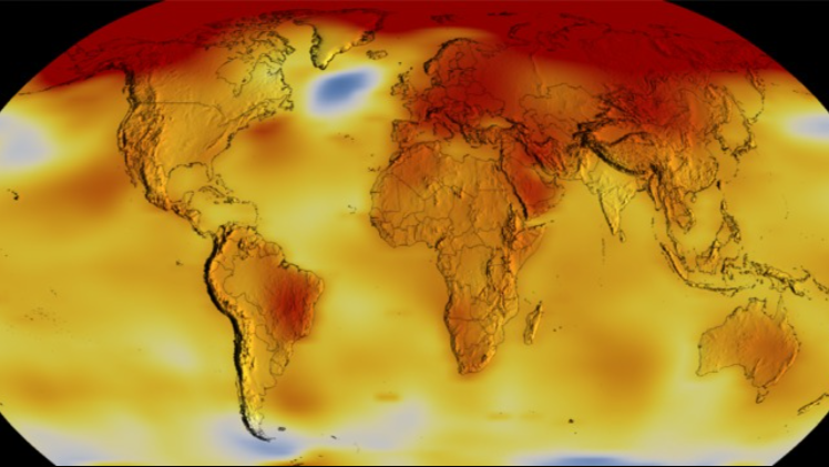
Key Question: Does the data in State of Fear disprove climate change?
Content: Matched Pairs | One-Sample t-Interval for a Population Mean Difference
Alignment: CED Topics 4.2-4.3
Video
See the video on YouTube.
Course Resources
Resources for teaching our AP® Statistics curriculum.
- Lesson Flow - timing and flow of class, using our lesson materials
- Pacing Guide - pacing our units, with daily or block schedules
- CED Alignment Guide - aligning our lessons to the AP® Statistics Course and Exam Description
Teaching Resources
Resources for teaching with Skew The Script.
- Discussion Norms - our model discussion norms for the classroom
- Letter to Parents - letter to share with parents about our nonpartisan approach
- Teaching Math on Civic Topics - tips for teaching math lessons that cover civic topics
Lesson Notes
Lesson-specific insights from the creators of this lesson.
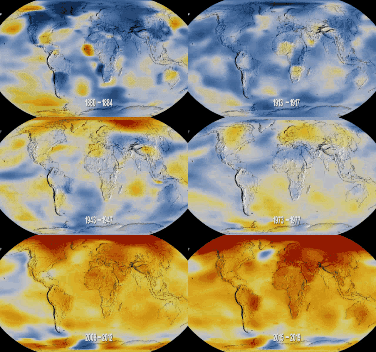
In this lesson, students analyze data from the book State of Fear. The novel depicts eco-terrorists plotting mass murder for the sake of publicizing the apparently false theory of global warming. Even though the plot is fiction, the book has many graphs of real data, footnotes to scientific articles, and a 20-page bibliography. The book was a best-seller when it was released and, to this day, remains one of the most cited works by climate change skeptics. Students consider a particular argument and data set from the book as they determine whether the evidence presented against climate change is convincing.
- Identify matched pairs scenarios
- Construct and interpret a one-sample t-interval for a population mean difference
Before proceeding: Familiarize yourself with the lesson materials linked above (e.g. handout, handout key, slides, video). Then, for additional background and teaching tips from the lesson creators, check out the sections below.
- The large majority of climate scientists report that climate change is real and currently happening. However, rather than beginning the lesson with that final conclusion, it’s more powerful to allow students to openly analyze the argument and data from State of Fear. This provides them the opportunity to apply principles of statistical reasoning to identify the “cherry-picked” data in the book. Then, later in the lesson, students get the opportunity to see evidence of warming from a more representative sample of temperature stations across the globe.
- The new statistical content in this lesson is the concept of matched pairs data. Once students recognize the matched structure and calculate a difference for each pair, the analysis becomes a familiar one-sample t-interval problem, with the differences serving as the quantitative variable. Emphasizing this connection can help students see the one-sample t-interval for a mean difference as an application of a familiar procedure (the one-sample t-interval), rather than yet another new procedure to remember.
- The lesson provides an opportunity to consider how the selection of data can influence a conclusion. The Punta Arenas data are real, but the station appears to have been selected from many possible locations because it supports a particular argument. Resurfacing the idea of sampling bias (from Unit 1) in class will help students draw a connection to ideas from earlier in the course.
First, download this lesson's Handout Key and read through its Discussion Question section. Then, check out our model discussion norms and the additional background notes below.
- The Discussion Question provides an opportunity to emphasize that statistical evidence rarely eliminates uncertainty. The confidence interval provides evidence that average temperatures increased, but it does not resolve questions about the future speed or severity of climate change, the effectiveness of possible responses, or the costs associated with those responses. Encourage students to distinguish between what the data analysis alone can show and the broader cost-benefit judgments involved in policymaking.
- Students may have differing views about climate policy. Keeping the discussion centered on the factors a policymaker would need to weigh, rather than requiring debate about a particular policy response, can help students distinguish statistical conclusions from decisions made using those conclusions.
- The data in this lesson come from NASA’s GISS surface temperature data set. Specifically, we utilize the "Adjusted cleaned" dataset from NASA, which they describe as "adjusted data after removal of some outliers and duplicate records.“ Michael Crichton appears to use the unadjusted and uncleaned data in the chart displayed in State of Fear, but the patterns at Punta Arenas and other areas are largely the same.
- NASA’s GISS Surface Temperature Analysis (GISTEMP) provides NASA’s own estimates of changes in global surface temperature using data from weather stations and other sources around the world. Estimating global temperature change can be complex, as temperature patterns can vary by location, elevation, measurement instrument, and other characteristics. GISTEMP therefore uses temperature anomalies and methods designed to account for uneven geographic coverage and other sources of variation. NASA publicly documents its data, methodology, and uncertainty. For additional background, see NASA’s GISTEMP website.
- State of Fear provides a useful example of how cherry-picking can occur without fabricating or incorrectly reporting data. The Punta Arenas temperatures shown in the book are real, but the station does not appear representative of the broader pattern: in the random sample used in the lesson, most stations experienced warming and the mean temperature difference was positive.
- In matched pairs data, the pairing itself contains information. Observations are paired because they share something meaningful, such as coming from the same person or location, or from individuals deliberately matched on relevant characteristics. Analyzing differences within pairs can account for some of the variation associated with those shared characteristics, allowing the analysis to focus more directly on the comparison of interest. This connects to the broader statistical idea of controlling for extraneous variables.
- Once paired observations are converted to differences, the differences become the variable of interest. The sample size is therefore the number of pairs, not the total number of individual measurements. In addition, the conditions for inference apply to the distribution of differences, rather than the distributions of individual measurements.
- Zero has a natural interpretation when constructing a confidence interval for a mean difference: it represents no average difference between the paired measurements. If zero is not contained in the interval, the interval provides evidence of a difference. In this lesson, the entire interval is positive, providing evidence of an increase in average temperature.
- Students can sometimes confuse inference for matched pairs (the mean of differences) with inference for two-samples (the difference between two means). However, inference for two-samples will be covered in a later lesson, and so the distinction doesn’t need to be broached here. The first two-sample lesson in Unit 4, Part B of the course will include practice for students in distinguishing between matched-pairs and two-sample scenarios.
Student Supports
Lesson-specific resources to support all learners.
- When identifying matched pairs, emphasize that having the same number of observations in two sets does not, by itself, make the data paired. There must be a meaningful reason to match each observation in one set with a specific observation in the other. Asking “Why does this value belong with that value?” can help students recognize that arbitrary matches do not create a matched pairs structure. However, meaningful matches (e.g. comparing identical twins) create a matched pairs structure.
- Encourage students to clearly define the direction of the difference before calculating. For the climate data in this lesson, writing “later – earlier” makes the sign meaningful: positive differences indicate warming and negative differences indicate cooling. Maintaining the same order when defining μd, calculating differences, and interpreting the interval can help keep the analysis consistent.
- Vocabulary used in the context of the lesson may include words that are unfamiliar or have several meanings. In particular, the following mathematical terms may need clarification or a definition provided:
- Matched pairs
- Paired observations
- Mean difference
- In addition, the following contextual terms may need clarification or a definition provided:
- Cherry-picking
- Climate change / global warming
- Climate change mitigation