
Lesson 6.1 - Describing Two Quantitative Variables

Key Question: Would raising attendance also raise test scores?
Content: Bivariate Data | Describing Scatterplots | Correlation Coefficient (r)
Video
Course Resources
Resources for teaching our High School Statistics curriculum.
- Lesson Flow - timing and flow of class, using our lesson materials
- Pacing Guide - pacing our units, with daily or block schedules
- Alignment Guide - aligning our lessons to national and state standards for high school statistics
- Classroom Routines - a guidebook of classroom routines embedded within our lessons
Teaching Resources
Resources for teaching with Skew The Script.
- Discussion Norms - our model discussion norms for the classroom
- Letter to Parents - letter to share with parents about our nonpartisan approach
- Teaching Math on Civic Topics - tips for teaching math lessons that cover civic topics
Lesson Notes
Lesson-specific insights from the creators of this lesson.

Low-income students tend to have lower math exam scores, on average. In addition, schools in low-income areas tend to have more chronically absent students. So, is the key to closing the achievement gap to first close the attendance gap? In this lesson, students analyze data that shows a strong association between attendance and test scores. Then, they confront a surprising result: in many districts that improved attendance, test scores didn’t significantly change. How is this possible? Students investigate.
- Determine the explanatory and response variables in bivariate quantitative data
- Describe form, direction, strength, and unusual features in scatterplots
- Use the correlation coefficient (r) to describe the strength and direction of an association
- Distinguish correlation from causation
This lesson’s Lesson Starter activates students' prior understanding of coordinate points on the xy-plane and linear relationships. As they progress through this lesson (and the next lesson), they draw on this prior knowledge to informally (and, in the next lesson, formally) describe relationships between variables. Students explore bivariate (two variable) data using scatterplots, as they refine their descriptions of bivariate relationships. Then, they consider how correlation coefficients can describe these relationships. In the next lesson, students will further formalize their descriptions of linear associations, as they use the equations of linear models to make predictions.
Before proceeding: Familiarize yourself with the lesson materials linked above (e.g. handout, handout key, slides, video). Then, for additional background and teaching tips from the lesson creators, check out the sections below.
- Throughout the lesson, it is helpful to emphasize how remarkably strong the association is between attendance and test scores. The strength of the association, combined with its positive direction, will naturally entice students into viewing the relationship as causal. Then the discussion question’s result – that raising attendance did not significantly improve test scores – becomes even more surprising. The surprise sticks with students and serves as an anchor moment for distinguishing correlation from causation throughout the unit.
- This lesson introduces the language and tools students will use to describe relationships between two quantitative variables. As students learn to identify form, direction, strength, and unusual features, it can be helpful to continually comment on these features in the scatterplots they analyze throughout the unit. This practice supports later work in the unit with correlation, regression equations, and the coefficient of determination (r2).
First, download this lesson's slide deck and handout key to see the prompt and sample responses for the Lesson Starter. Then, check out the additional background notes below.
Instructional routine: Ten-Minute Talk. The lesson provides space for students to jot down their thoughts on the prompt, before discussing with a partner and engaging in whole group discussion. In this case, they are asked to tell a story. It may make sense to offer more time for the independent thinking (writing) portion for this prompt and to only use a few examples for discussion (reducing whole group discussion time). You can find more background on implementing a Ten-Minute talk here.
Purpose & Background: This Lesson Starter is designed to get students thinking about the stories of scatterplots. It also provides an opportunity to formatively assess what students may already know about associations between two variables. Throughout the lesson, students will explore ways to determine and describe relationships identified through scatterplots, including direction and strength. In the Lesson Synthesis, students are invited to refine the story they created in the Lesson Starter by replacing their informal descriptions with the more precise language from the lesson.
First, download this lesson's handout key and read through its Discussion Question section. Then, check out our model discussion norms and the additional background notes below.
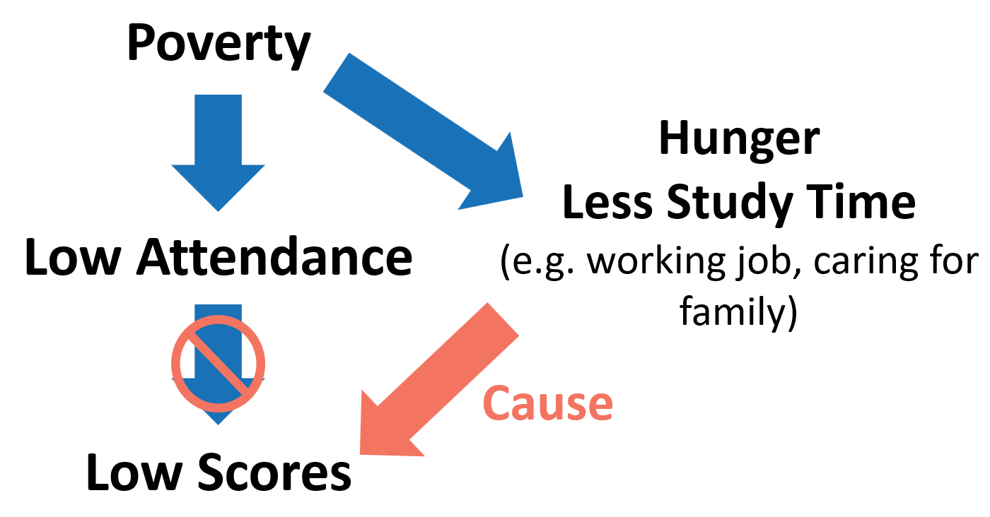
- The diagram below may be helpful when discussing the statement from the handout key: “Students experiencing poverty might not only face attendance barriers. They might also experience hunger or have less study time (due to working a job or taking care of siblings). Because of these confounding factors, focusing solely on attendance may not provide students with all the resources they need to be successful.”
- There are additional possible confounding variables that students may identify during the discussion. Common examples include access to tutoring, housing stability, and school resources. The key idea is that these factors may simultaneously influence both attendance and academic achievement.
- The attendance context provides a useful example of why strong associations should be interpreted cautiously. The lesson intentionally presents a remarkably strong relationship between attendance and achievement, before introducing evidence that attendance interventions did not substantially improve test scores. This creates a natural opportunity to discuss the distinction between association and causation.
- Research on chronic absenteeism has found that attendance is associated with a wide range of student outcomes, particularly among students experiencing poverty. At the same time, researchers have identified many factors that influence attendance, including health, transportation, housing stability, family circumstances, and school conditions. These factors provide concrete examples of potential confounding variables that may influence both attendance and academic achievement.
- There are three common correlation / causation fallacies. High School Statistics primarily focuses on the first, but it is helpful to understand all three:
- Confounding variable fallacy: A lurking variable influences both the explanatory and response variables simultaneously, creating the observed association. This is the primary focus of the lesson’s attendance example, and students may be able to think back to numerous other examples from the course.
- Directional fallacy: Occurs when we believe X causes Y, but in reality, Y causes X. For example, we might assume that higher attendance causes stronger academic performance, when in reality stronger academic performance increases positive feelings about school, which then leads to higher attendance rates. More examples and explanations of this fallacy can be found here.
- Spurious correlation fallacy: Occurs when two variables are correlated purely by chance, despite having no meaningful connection. For striking examples of these, check out this great collection of spurious correlations from Tyler Vigen. One such example is the surprisingly strong association between the number of Disney movies released per year and the yearly motor vehicle theft rate across the United States.
- The terms explanatory variable and response variable are preferred over independent variable and dependent variable because they imply fewer assumptions about the nature of the relationship. In many observational studies, one variable may help explain or predict another, without implying a causal relationship. Using explanatory and response language helps reinforce this distinction, rather than using “dependent” (which could imply causation). In addition, the word “independent” already has a specific meaning elsewhere in statistics and probability, so this terminology helps avoid unnecessary ambiguity.
- A large-magnitude correlation coefficient does not guarantee that a linear model is appropriate. Anscombe’s Quartet provides a striking example: four data sets with identical correlation coefficients can exhibit dramatically different patterns, including non-linear relationships and influential outliers. Reinforce that scatterplots should always be examined before interpreting r.
- Outliers in a bivariate setting differ from outliers in a univariate setting. A point is not necessarily unusual simply because it is far from the other observations. Instead, an outlier is a point that does not follow the overall pattern seen in the data. This idea will be revisited later through residuals and regression.
Student Supports
Lesson-specific resources to support all learners.
- For confounding variables, it can be helpful to begin with a simpler example before discussing attendance and achievement. The classic ice cream sales and drowning example provides a straightforward introduction to the idea of a lurking variable before students encounter the more nuanced discussion of poverty, attendance, and academic achievement.
- Deciding when a linear model is appropriate can be challenging. Students sometimes focus on the fact that points do not lie perfectly on a line and conclude that a linear model is inappropriate. It can be helpful to encourage students to focus on the overall pattern of the data, rather than individual deviations from the trend. The points do not have to be perfectly on a line for a linear model to provide a reasonable fit to the overall pattern.
- Encourage students to examine the scatterplot before calculating the correlation coefficient. A large-magnitude r value does not guarantee that a linear model is appropriate, and a scatterplot is necessary to assess form, unusual features, and potential outliers before interpreting the correlation.
- Vocabulary used in the context of the lesson may include words that are unfamiliar or have several meanings. In particular, the following mathematical terms may need clarification or a definition provided:
- Bivariate
- Explanatory variable
- Response variable
- Scatterplot
- Association
- Correlation
- In addition, the following contextual terms may need clarification or a definition provided:
- Attendance
- Attendance case managers
- Ride shares
- While in other courses, particularly science classes, the horizontal axis is consistently referred to as the “independent variable” and the vertical as the “dependent variable,” avoiding these labels for statistical analysis helps students to avoid jumping to causal conclusions that the data may not support.
- It’s helpful to reinforce that the terms “association” and “correlation” are related, but they’re not fully synonyms. We use the term correlation to describe the linear relationship between two variables. We use the term association to describe any noticeable relationship between two variables – whether the form of that association is linear or non-linear.