Desmos is coming to AP Stats
By Bob Lochel & Juan Gómez
The College Board has announced that Desmos Studio’s free online graphing calculator will now be embedded within AP’s online testing platforms (AP Classroom & Bluebook) for AP Stats.
Of course, students will still be allowed to use handheld graphing calculators on the AP Stats exam. However, Desmos provides a solid new option - especially for students who have consistent access to computers in class.
This big shift comes on the heels of two other important changes in the field:
With learning moving online for the Covid-19 pandemic, schools worked hard to deepen their internet capacities and provide laptops to all students (via computer labs, in-class chromecarts, or one-to-one loaner programs). Seeing the value of these programs, they’ve persisted in many places, giving high school students broader access to computing power than ever before.
Desmos Studio added important stats functionality to their online calculator, releasing a suite of new inference capabilities and improvements for probability distributions.
To help prepare everyone for this brave new world, we wanted to share a summary of some of the changes, along with some teaching tips for leveraging these features to help your students understand statistical concepts.
Probability Distributions
The new features can be accessed through the main Desmos calculator interface. Specifically, you’ll see that there’s a new Inference widget, which is located under the Add Item menu - the plus sign - located on the top-left of the screen.
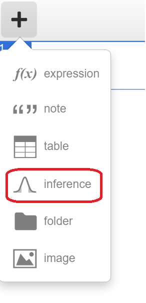
The probability distributions menu features 4 continuous distributions (normal, t, chi-squared and uniform) and 3 discrete distributions (binomial, poisson and geometric).
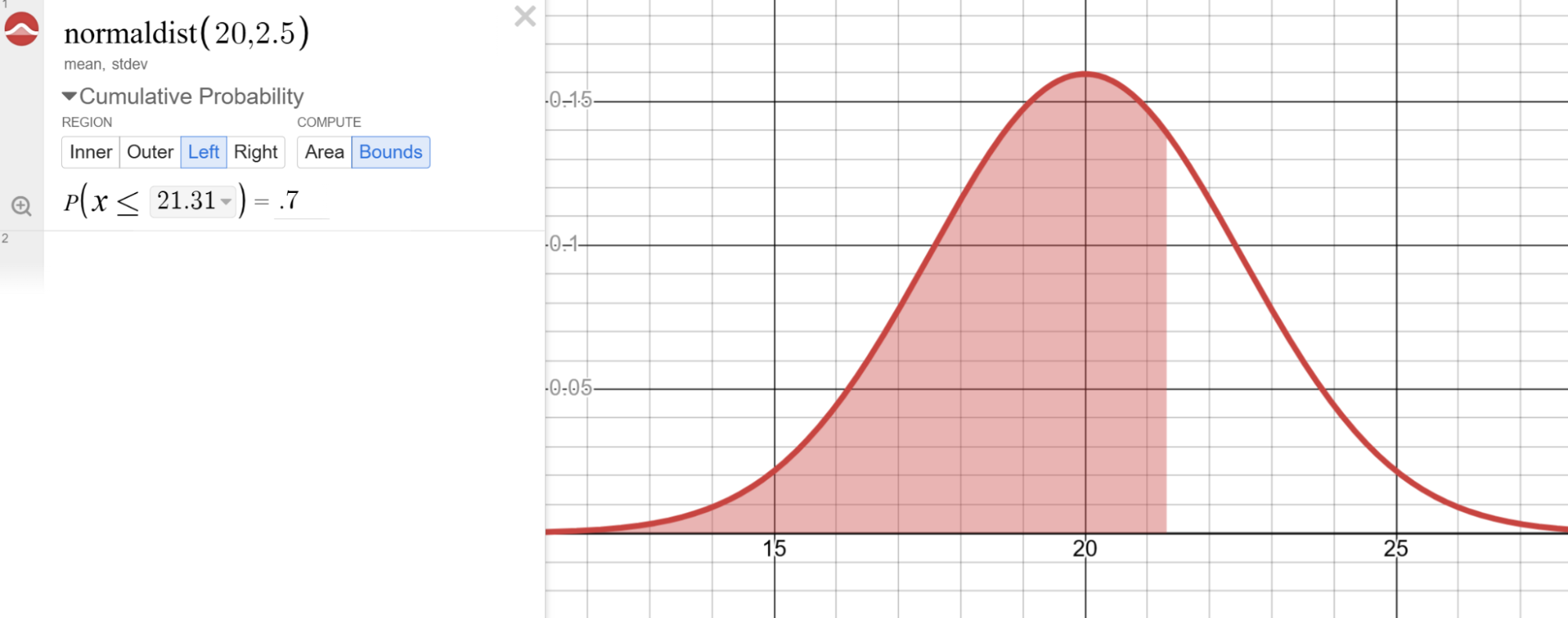
In most statistics courses, the normal distribution is the first probability distribution encountered, and is utilized throughout the course with sampling distributions and inference. After selecting the normal distribution and providing a mean and standard deviation, users can then find probabilities for four distinct regions - Inner, Outer, Left and Right. Recently added in the latest update is the ability to find a cut-off score for a selected region under “Compute - Bounds”, which is helpful in problems involving percentiles.
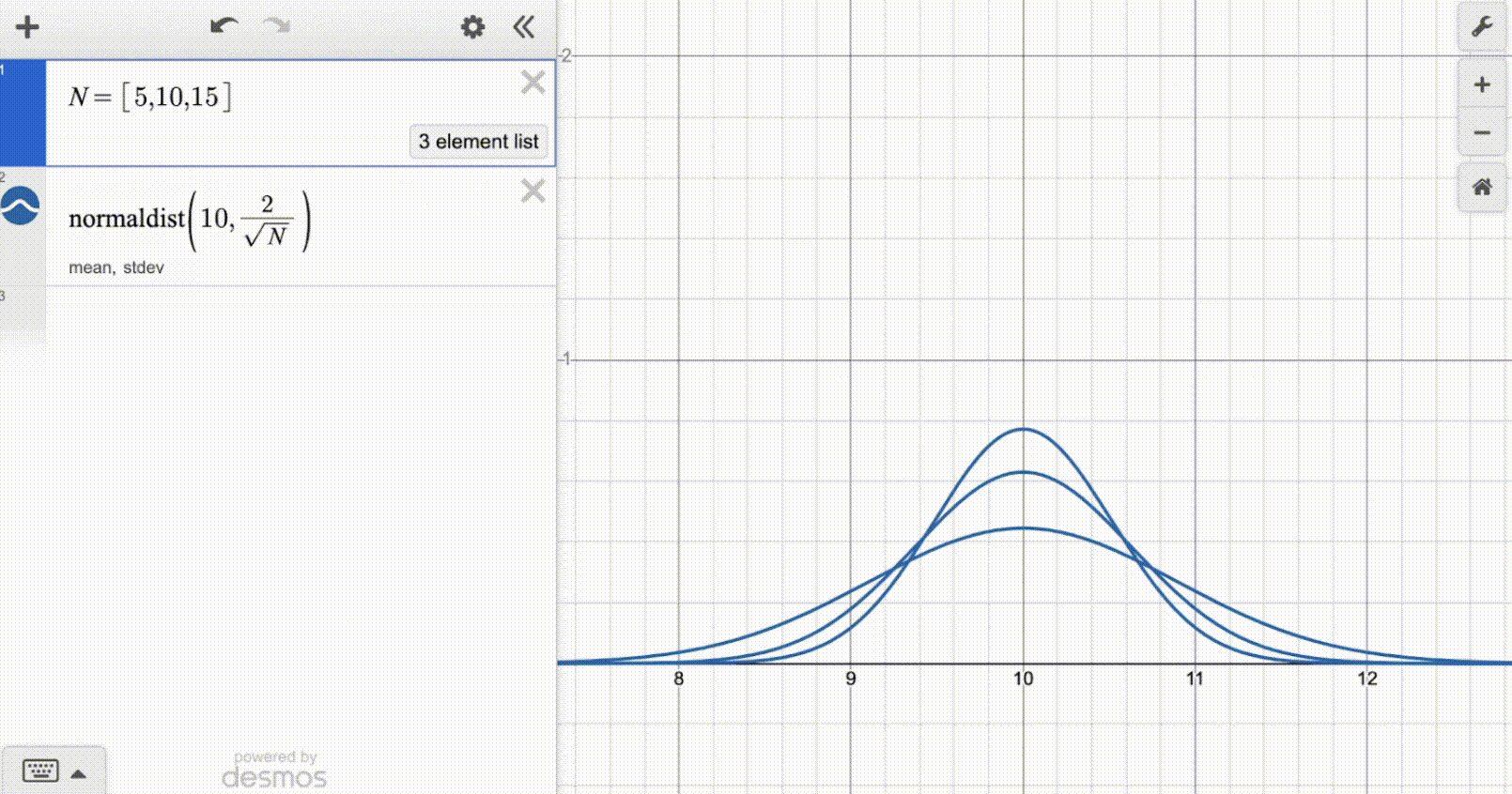
Teaching Tip: When introducing sampling distributions for a sample mean, combine a normal distribution with the power of lists to investigate the influence of sample size on a sampling distribution.
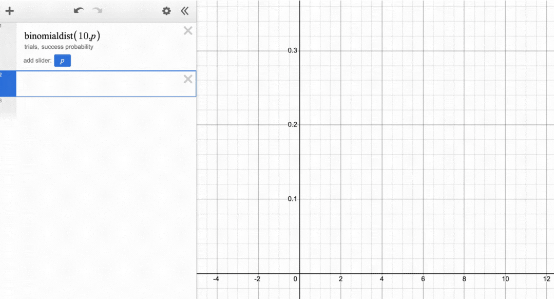
For the binomial distribution, users have the same options for cumulative probability - Inner, Outer, Left and Right. In addition, clicking the top of any individual outcome bar provides the probability.
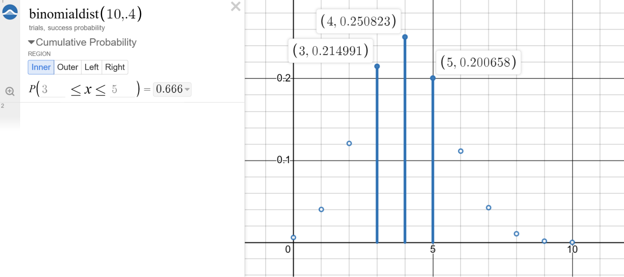
Teaching Tip: Have students replace the success probability with “p”, which creates a slider useful to investigate the behavior of the binomial distribution. The number of trials can also be made into a slider. Investigate the shape of the binomial distribution and think about when the shape approaches a normal distribution - a very helpful concept as students move towards formal inference for proportions!
Inference
In addition to the Probability Distributions, the Inference wizard offers students the ability to conduct inference procedures using either data or summary statistics. One of the first things you notice is the inference procedures are split into two groupings: one labeled “Inference for Quantitative Data” and the other “Inference for Categorical Data.”

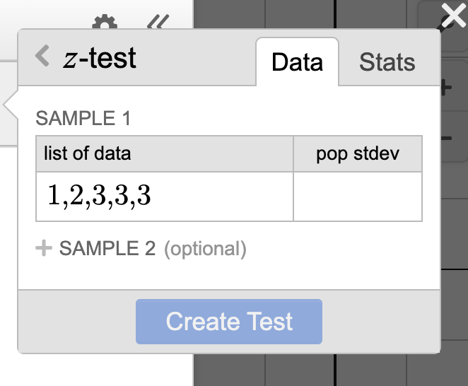
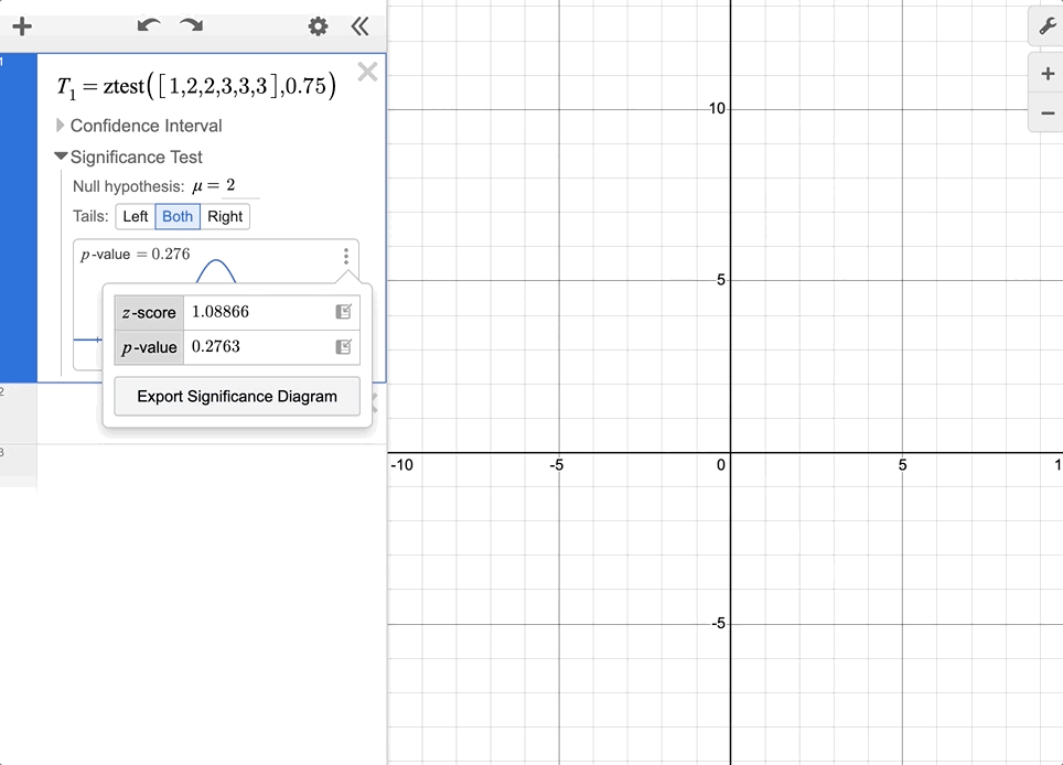
Under Inference for Quantitative Data, you’ll find buttons for either a z-test or a t-test. You’ll have the option to input either data or statistics.

Once you create the inference procedure, you can choose between investigating further with either a confidence interval or a significance test. In the confidence interval drop down you will find a visual representation of the confidence interval and an input box that allows you to enter a confidence level. If you click on the three dots to the right of the confidence interval diagram, you see lower and upper bound, the point estimate, and the standard error which can all be exported to the expression line.
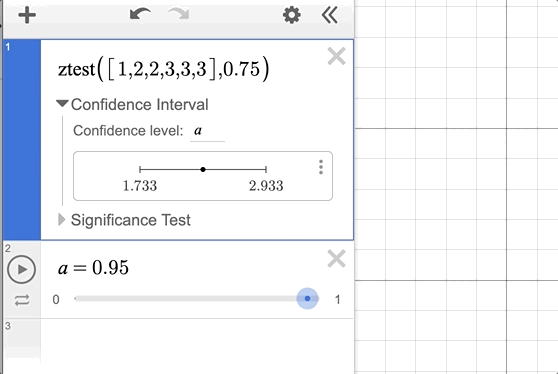
Teaching Tip: In the confidence interval menu, make the confidence level a variable controlled by a slider. The confidence interval will adjust accordingly as you change the confidence level.
If you would prefer to run a significance test, you can click on the dropdown menu for that option. Doing so reveals a variety of useful tools. From the Significance Test menu you can select a null hypothesis and whether to run a one or two tail test.
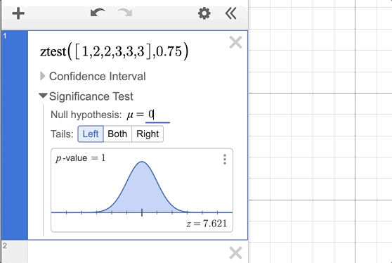
Teaching Tip: Export the Significance Diagram by pressing the three dots next to it. This copies the Significance Diagram to the larger graphing area, allowing you to leverage the tools from the Probability Distributions within your inference procedure. Very useful when making connections between statistical ideas!
The inference tools in the t-test procedure follow the same intuitive approach, encouraging statistics users to explore the connections between the processes and the visual representations.
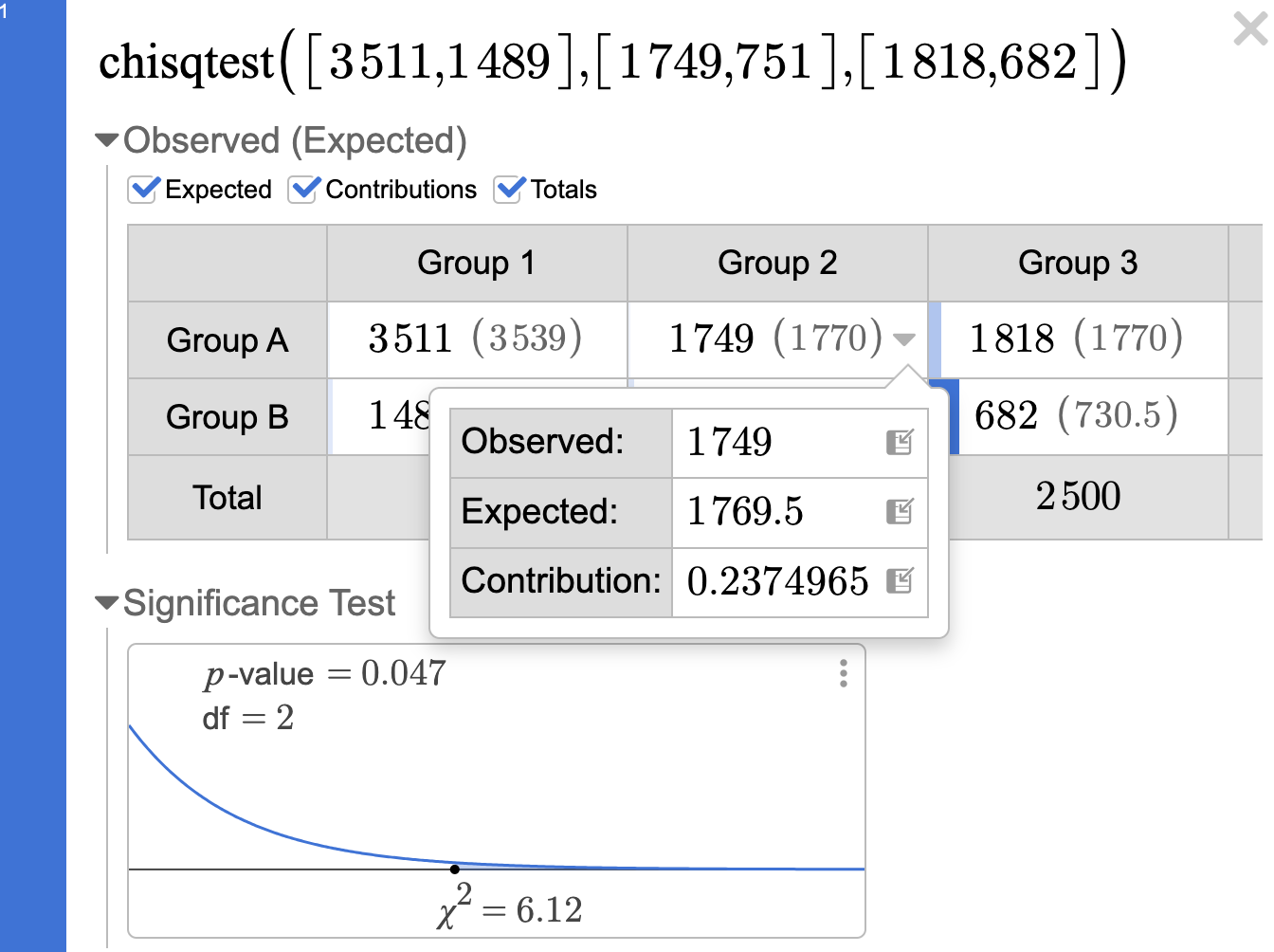
One particularly snazzy new area is the inference procedures around the chi-squared distribution. The inference wizard takes data in tabular form and allows you to progressively dig deeper into the procedure as you investigate the relationship between the two variables.
Need expected counts? Click the box and they appear! Same process for row and column totals. Contributions get the Desmos treatment and show up visually using shading inside of the corresponding item that contributed the most to the chi-squared test statistic.

Teaching Tip: Each box within the table has its own dropdown menu with observed and expected counts, with more decimal places shown. You can export each of these items to an expression line for use in calculations.
These are only a few highlights of the many new statistical tools offered in the Desmos calculator. We hope you enjoy exploring all it has to offer - we know that we will!

Bob Lochel just finished his 28th year at Hatboro-Horsham High School outside of Philadelphia. He has taught AP Statistics since 2004, and participated in the AP exam reading since 2012, with the last 6 years as a table leader. Bob was also part of the first Desmos Fellowship cohort in 2017.

Juan Gómez is a math and statistics teacher at Carmel High School. He has participated in the AP Statistics reading the past four years. Juan is an AP Summer Institute workshop consultant and a member of Cohort 3 of the Desmos Fellowship.