Lesson 1.A.3 - Describing a Quantitative Variable

Key Question: Why would anyone make a movie about the A’s?
Content: Dotplots, Stem-and-Leaf Plots, & Histograms | Describing a Quantitative Variable
Alignment: CED Topics 1.5 - 1.6
Video
Course Resources
Resources for teaching our AP® Statistics curriculum.
- Lesson Flow - timing and flow of class, using our lesson materials
- Pacing Guide - pacing our units, with daily or block schedules
- CED Alignment Guide - aligning our lessons to the AP® Statistics Course and Exam Description
Teaching Resources
Resources for teaching with Skew The Script.
- Discussion Norms - our model discussion norms for the classroom
- Letter to Parents - letter to share with parents about our nonpartisan approach
- Teaching Math on Civic Topics - tips for teaching math lessons that cover civic topics
Lesson Notes
Lesson-specific insights from the creators of this lesson.

This lesson explores some of the data behind every statisticians’ favorite movie: Moneyball. Specifically, students analyze the distribution of baseball team payrolls – and the wide spread between them – that made the Oakland A’s 2002 playoff run so special. The movie and the story behind it provides the perfect context for motivating the need to visualize and describe quantitative data. Plus, we always love an excuse to watch more clips of Brad Pitt 😊.
- Interpret dotplots, stem-and-leaf plots, and histograms
- Describe the center, unusual features, shape, and spread of a quantitative variable
Before proceeding: Familiarize yourself with the lesson materials linked above (e.g. handout, handout key, slides, video). Then, for additional background and teaching tips from the lesson creators, check out the sections below.
- When playing the initial clip of Brad Pitt (“There are rich teams and there are poor teams. Then there’s 50 feet of crap. And then there’s us.”), pause to have students consider how player talent may vary between the rich teams and the poor teams – and whether that’s “fair” in their eyes. This helps motivate the analysis of the distribution of team payrolls throughout the lesson.
- In a future lesson, students will learn how to find and calculate exact measures of the center (the mean and median). For now, you can let them know that a rough visual estimate of the “middle” or “central” value is sufficient.
- The exact minimum and maximum values are not visible in a histogram. So, in the guided notes, students describe the spread for a histogram as the distance between the lowest bin of values and highest bin of values. Advise students that for dotplots and stem-and-leaf plots – where the exact minimum and maximum data values are visible – they should report the spread as the distance between the minimum and maximum.
First, download this lesson's Handout Key and read through its Discussion Question section. Then, check out our model discussion norms and the additional background notes below.
- For part (b) of the Discussion Question, another point that the “yes” side might raise: if a team is consistently not competitive, their fan base will get tired of seeing the losses and will tune out. For the fandom of the sport to thrive, you’d want as many teams as possible to be competitive. Making team payrolls more equal helps this outcome.
- To help students visualize the distribution before and after the luxury tax, you can use these extra slides: ppt, pdf.
- To help students make connections between payrolls and team quality throughout the lesson, ask them early in the lesson: “Which teams would you expect to get the best players? Why?”
- The field of statistical analysis for baseball is called sabermetrics, named for the Society of American Baseball Research (SABR). The movie Moneyball helped popularize sabermetrics, and it has grown into a deep field of research and study. The second movie clip in the lesson gives motivation for sabermetrics, displays some real sabermetric formulas, and mentions Bill James – a famous early pioneer of sports statistics. Of course, students do not need to know anything about sabermetrics to fully participate in the lesson. But it’s a great first look for students interested in exploring the field of sports statistics as a career.
- For practicing data scientists, one of the first steps of any analysis process (after retrieving and cleaning data) is visualizing data. Because models can be heavily influenced by undetected outliers, faulty data, or unusual features, going straight into calculations or model building before “getting to know the data” by visualizing and exploring it can lead to missteps. This step of visualizing and exploring data is sometimes called Exploratory Data Analysis or EDA.
- Stem-and-leaf plots were especially useful in the pre-computer era. However, they aren’t used in the field much anymore. For small data sets, dotplots are most common. For larger data sets, histograms and boxplots (covered in a later lesson) are most common.
Student Supports
Lesson-specific resources to support all learners.
- Stem-and-leaf plots are graphed vertically. To help students determine their shape, advise them to rotate their papers 90 degrees counterclockwise. This returns the plot to a horizontal axis, making the shape clearer.
- When reading histograms, students may confuse values and frequencies, inferring that the highest bars represent the highest data values. The highest bars actually represent the most frequent values – not necessarily the largest values. To help make this distinction, ask students, “Which team has the highest payroll in the team payroll dataset?” (it’s the Yankees). Then ask students to point to the histogram bin that contains that team. Then ask them, “Is this bin the tallest one on the graph? Why would the highest payroll team not be in the tallest bin?”
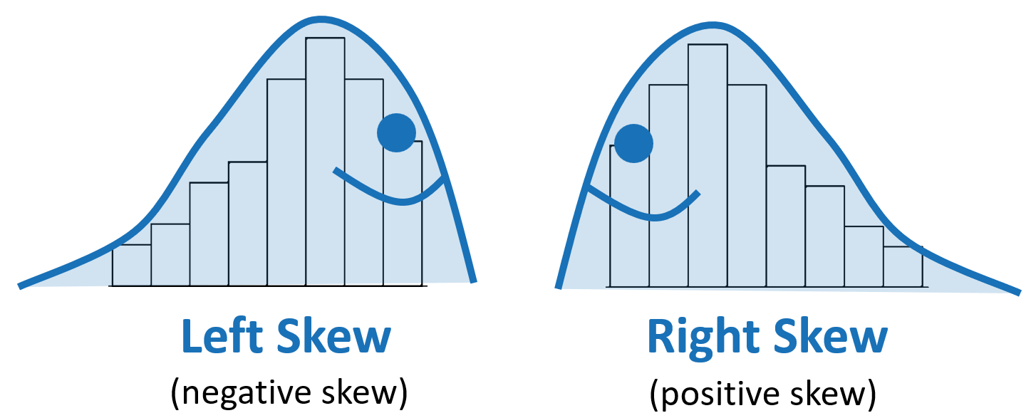
- To help with determining left vs right skew, have students “draw the slug.” The tail of the slug points in the direction of the skew. See example here:
- Vocabulary used in the context of the lesson may include words that are unfamiliar or have several meanings. In particular, the following mathematical terms may need clarification or a definition provided:
- Dotplot
- Stem-and-leaf plot
- Histogram
- Intervals (bins)
- Shape
- Mode
- Uniform
- Unimodal
- Bimodal
- Left skew (negative skew)
- Symmetric
- Right skew (positive skew)
- Spread
- Range
- Center
- In addition, the following contextual terms may need clarification or a definition provided:
- Payroll