Lesson 1.A.6 - Comparing Graphs & Z-Scores
Key Question: Who is the greatest scorer in NBA history?
Content: Comparing Distributions | Z-Scores
Alignment: CED Topic 1.9
Video
Course Resources
Resources for teaching our AP® Statistics curriculum.
- Lesson Flow - timing and flow of class, using our lesson materials
- Pacing Guide - pacing our units, with daily or block schedules
- CED Alignment Guide - aligning our lessons to the AP® Statistics Course and Exam Description
Teaching Resources
Resources for teaching with Skew The Script.
- Discussion Norms - our model discussion norms for the classroom
- Letter to Parents - letter to share with parents about our nonpartisan approach
- Teaching Math on Civic Topics - tips for teaching math lessons that cover civic topics
Lesson Notes
Lesson-specific insights from the creators of this lesson.
This lesson gets students debating one of our country’s most controversial questions: Who is the GOAT? Specifically, who is the Greatest Of All Time to have played in the NBA? Students compare different eras of basketball using data visuals and z-scores before deciding who takes the crown. Get ready to watch your Jordan and LeBron fans duke it out in class – statistically.
- Compare distributions of quantitative data
- Calculate and interpret z-scores
- Use z-scores to compare data values
Before proceeding: Familiarize yourself with the lesson materials linked above (e.g. handout, handout key, slides, video). Then, for additional background and teaching tips from the lesson creators, check out the sections below.
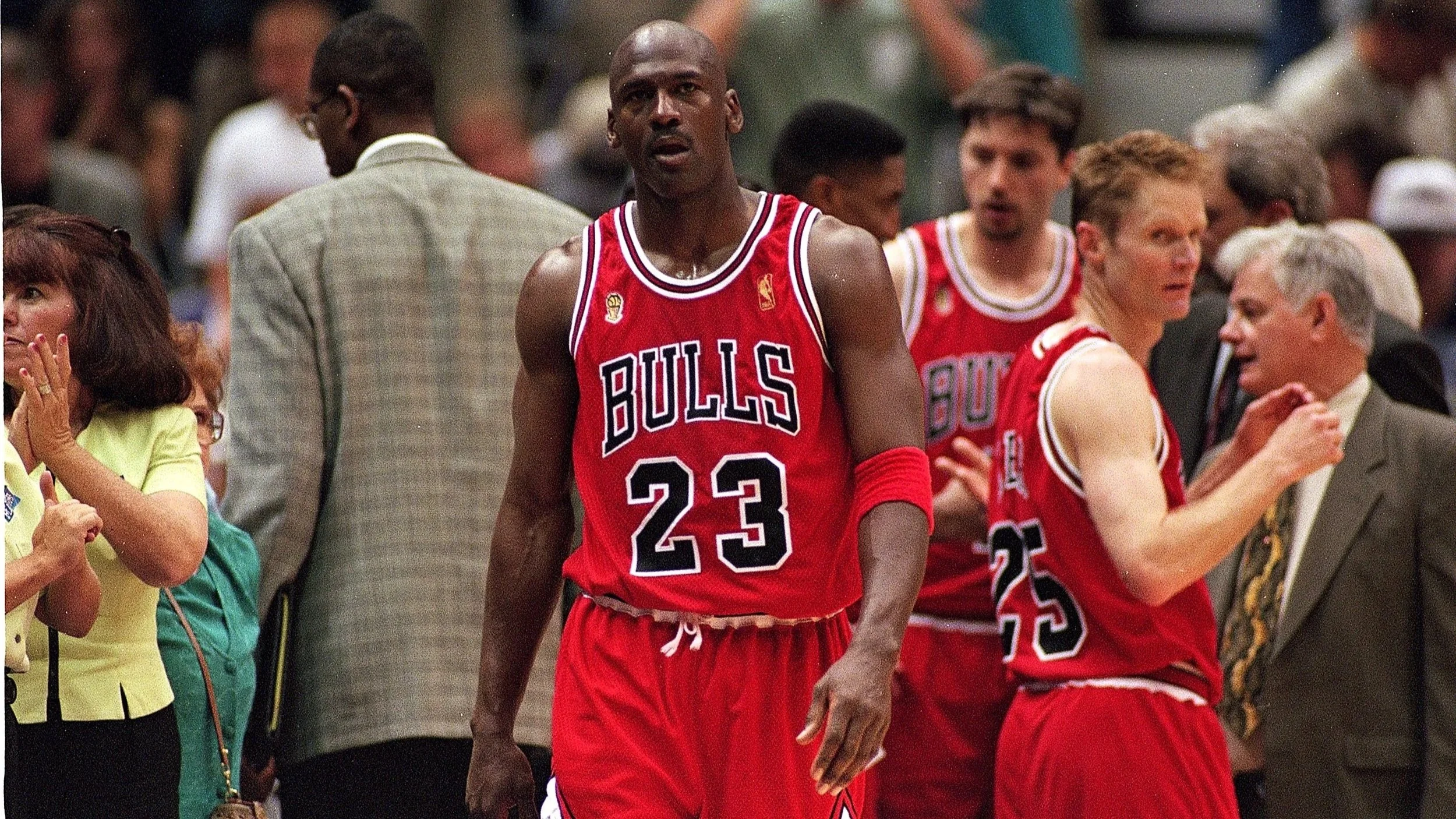
- Not all students will know these players (Wilt Chamberlain, Michael Jordan, and LeBron James). Discussing each of their key accomplishments (Wilt’s 100 point game, Jordan’s 6 rings, and LeBron’s scoring title) helps motivate the conversation. In addition, having students who are basketball fans voice their own opinions - and argue - before diving into the math helps create interest across the class. Not all students may be interested in basketball before walking into class, but the spirit of debate is infectious. Before you know it, every student in class gets into it.
- When comparing graphs, it’s important to emphasize the need for comparative language. AP graders are going to be looking for words like higher, greater, lower, or smaller. If students slip into generic language, such as “the first median is x while the second median is y,” they may lose points for not making a directional comparison.
- A conceptual understanding of z-scores is critical for later units in the course, particularly for normal curve calculations and for statistical inference. Every time a student calculates a z-score (e.g. 2.5), ask them to interpret it (e.g. the data value is 2.5 standard deviations above the mean) and comment on its unusualness (e.g. since the data value is well above 2 standard deviations away from the mean, it’s unusual). You’ll be thanking yourself later in the year, when students have to apply this same concept to interpreting z-test statistics in a hypothesis test.
First, download this lesson's Handout Key and read through its Discussion Question section. Then, check out our model discussion norms and the additional background notes below.
- Ultimately, this sort of statistical question of “who was best” is somewhat subjective. Do you choose to look at total points? At efficiency? At strength of defense? At “clutch” moments? Expert sports statisticians debate these metrics. Ultimately, there is no single “correct” answer.
- For students interested in nerding out and diving further into the debate, challenge them to calculate the effective field goal percentage, true shooting percentage, and player efficiency rating of each player. These advanced analytics are meant to provide a more nuanced picture of player value. That said, these metrics are still debated, and there is still no universally accepted formula to calculate a player’s true “efficiency.”
- The full data set used in this lesson can be found here. Data from the 2017 season and earlier was sourced from this project. Data from after 2017 was sourced from Basketball Reference. The most recent data found in this lesson is from the 2024-2025 season. When this lesson was created, LeBron was still an active player in the NBA. Hence, his data may not be fully up-to-date. However, this probably works in LeBron’s favor, as his points per game has declined in his later playing years.
- The 120 players chosen to represent each player’s “era” are the 120 players that had the most games played during the same years as Wilt, Jordan, and LeBron. For example, Michael Jordan played from 1984-2003, with several gap seasons during that period. The athletes that played the most games during those same seasons were Karl Malone, Hakeem Olajuwon, Patrick Ewing, and Charles Barkley. The data set for Jordan’s era contains these four players and the remaining 116 players with the most games played in those same years.
- See the Extra Background: Discussion Question section above for more background on advanced basketball analytics.
- Z-scores are often associated with normal curve calculations. We’ll return to the idea of z-scores when we cover normal curves in later lessons. However, z-scores are also helpful for assessing the relative position of data values in non-normal distributions. This lesson provides an excellent example, as the distributions of points per game are not normally distributed.
- Z-scores are a particular case of standardization – the practice of transforming variables to put them on similar scales to one another. Standardization allows for better comparison of the same variable across contexts (e.g. comparing points per game in the 1960s vs the 2000s). It also allows for comparison across two entirely different variables (e.g. comparing a 10 second 100-meter dash time to a 70 ft shotput throw). In fact, standardization is an important feature in the creation of machine learning and artificial intelligence models. These models balance the many inputs they receive by standardizing them, which then allows for better predictions or outputs.
Student Supports
Lesson-specific resources to support all learners.
- To support student understanding of why we divide by the standard deviation to calculate z-scores, you can use the analogy of measuring a distance in physical space. Imagine the distance from the floor to the ceiling is 96 inches. How many feet is this? Well, because there are 12 inches in a foot, we can divide 96 by 12. This gets us 8 feet. Dividing by the standard deviation is similar to this – just as we divide to scale distances in terms of feet, we can divide differences to scale those differences in terms of standard deviations.
- Vocabulary used in the context of the lesson may include words that are unfamiliar or have several meanings. In particular, the following mathematical terms may need clarification or a definition provided:
- Z-score
- Comparative language
- Mean
- Standard deviation
- In addition, the following contextual terms may need clarification or a definition provided:
- G.O.A.T (Greatest Of All Time)
- Points per game
- Era